Freedom and Happiness
This week I came across the World Happiness Report, an annual survey which represents 156 of the world’s countries and how happy the citizens of these countries perceive themselves to be. The report calculates positive and negative emotion based on six key explanatory factors: social support, freedom, corruption, generosity, GDP and life expectancy.
I want to explore the correlation between freedom, the freedom to make life choices, and positive affect, the measure of positive emotion. More specifically, I want to see which countries have the happiest citizens and which countries do not based on the freedom that they have.
For this, I am using World Happiness Report data from 2005-2017 found on Kaggle, where each variable is represented on a scale from 0-1. So, the closer a data point value is to “1”, the more freedom or the happier the citizens of that country are.
When looking at the correlation between two continuous variables, the best way to visualize this is in a scatterplot or point plot. Scatterplots clearly show the relationship between two variables along with the range of data, and are also easy to plot and understand.
Let’s plot freedom on the X-axis and positive emotion on the Y-axis to see the correlation, if any, between the two variables for the year 2017. To do so, I will use ggplot() in R. Click here for the reference code to follow along!

Looking at the plot, we can see a clear positive relationship between the two variables. Both freedom and positive emotion increased as the other increased. This is aligned with the idea that citizens who have more freedom, have a higher positive emotion.
But which countries specifically had the happiest citizens?
Let’s filter the data set to only include the countries that have a positive emotion value above 0.8. In order to see which country is which, I will add a label to each data point with geom_label_repel(). This function will allow me to add data point labels, and the “repel” aspect will make sure that the labels do not overlap.
Let’s take a look below:

By only including the top countries with positive emotion, the scale for our plot has now changed to 0.8-0.9 for the positive emotion variable, and from 0.75 to 0.95 for the freedom variable. This reinforces the idea the countries with more freedom are happier; no country with a positive emotion value above 0.8 falls below a freedom value of 0.75.
We can now see which countries were the happiest. From the plot, Iceland, Costa Rica and Laos had the happiest citizens 2017 aligned with their freedom to make life choices.
However, this is not the case in all countries. Citizens of several countries face difficult situations hampering their ability to have the life that they want, and to be happy. Let’s now take a look at these countries by filtering the data set for positive emotion values below 0.5:
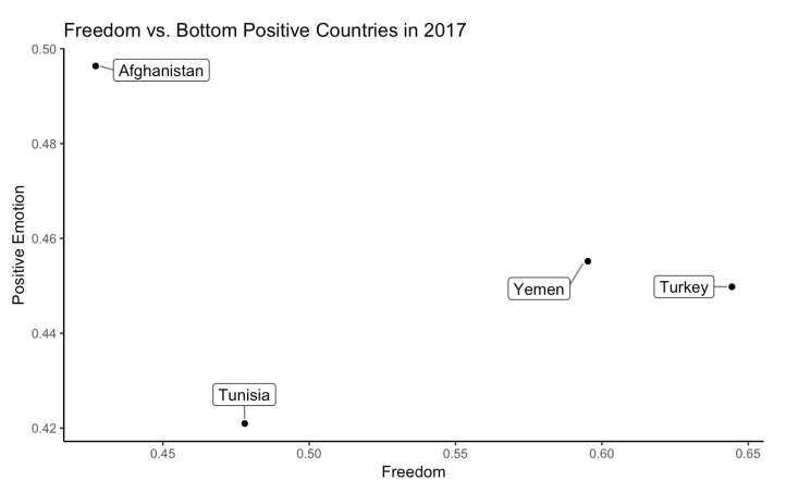
By only including the bottom countries with positive emotion, the scale for our plot has now changed to 0.42-0.5 for the positive emotion variable, and from 0.45 to 0.65 for the freedom variable. This reinforces the idea the countries with less freedom are not as happy; no country with a positive emotion value below 0.5 falls above a freedom value of 0.65.
From this plot, we can clearly see that Tunisia, Turkey, Yemen and Afghanistan had the lowest positive emotion values for 2017.
Does this data surprise you? Or is this what you expected? What questions might this raise? One thing I would like to know is how the positive emotion of these countries has changed over time relative to freedom.
In order to examine the time series data for several countries at one time, I will use a facet plot which splits one plot into a matrix of panels. Let’s take a look at the facet plot below to see how freedom (red) and positive emotion (blue) has changed for the bottom three countries from 2005-2017:
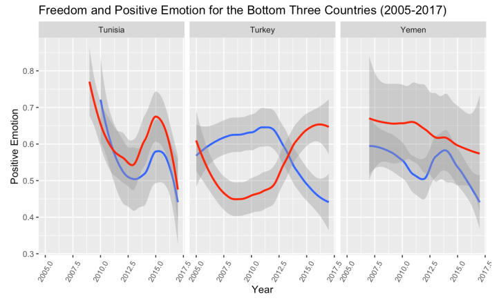
From these plots, we can see that each country has their own story to tell. Freedom and positive emotion have been on a downward trend for both Tunisia and Yemen, but act in opposite ways for Turkey. As freedom decreased, positive emotion increased and vice versa; implying that there are alternative underlying factors contributing to increased positive emotion in Turkey.
Seeing that these trends are consistent, we can expect that it will stay the same moving forward. But what would have to happen for these trends to change? Just some food for thought.
We just performed an Exploratory Data Analysis on two continuous variables, a.k.a. covariation. Unlike variation, covariation is the behavior between two variables in which you look at the way these variables vary together in a related way.
By plotting two variables together, we uncovered so many critical questions showing just how important it is to explore data and ask questions.
