A Look at Variation in Wine Data
If you read my last post on Exploratory Data Analysis, then you know that there are many ways to explore a data set. And if you haven’t read it yet, pause and Click Here to read it. This post covers how looking at the variation within a variable can reveal interesting information about the data that you are working with.
Variation specifically looks at how the values of a variable changes from one measurement to another. Because of this, each variable will have its own unique pattern, and the only way to see this pattern is to visualize the distribution of your variable.
Categorical vs. Continuous Variables
The way you visualize the distribution of your variable depends on what kind of variable it is: categorical or continuous.
Categorical variables represent information about a characteristic. For example, the category color could have values: red, blue, green..etc. The distribution of a categorical variable is best visualized using a bar chart.
Continuous variables, on the other hand, represent continuous measurements like age, height or weight. Unlike categorical variables, the distribution of a continuous should be visualized in a histogram.
To demonstrate the two, I will be using R in RStudio and will be working with a Wine Review Data set from WineEnthusiast, downloaded from Kaggle. This data set contains information like ratings, descriptions and more for a collection of 150K wines.
Click Here for the repository with my reference code.
Visualizing the Distribution of a Categorical Variable
First, I want to know what types of wines are represented in this data set. So, I will take a look at the distribution of the categorical variable “Variety”. The variety of a wine represents the type of grape used to make the wine.
As mentioned before, categorical variable distributions should be visualized in a bar chart. Since over 10,000 varieties of wine exist and will be too many categories to plot in a bar chart, I will only be looking at the top 15 varieties represented in the data set.
Let’s take a look at the bar chart below:

From this bar chart we can see that Chardonnay is the most represented wine in the data set, followed by Pinot Noir and Cabernet Sauvignon. These names aren’t too surprising as they are among some of the more common and well known varieties of wine.
Visualizing the Distribution of a Continuous Variable
Now, let’s look deeper into the data. We see that Chardonnay is a common wine, but how much do people pay for it? Let’s take a look at the distribution of Price for Chardonnay. Price is a continuous variable, so it has to be visualized in a histogram.
Let’s take a look at the histogram:

Looking at the histogram, we can see that the distribution of Chardonnay prices is heavily skewed to the right and that they are a few expensive Chardonnays up to ~$2,000, a.k.a. some outliers.
Typical and Unusual Values
What if we wanted to look at where these outliers begin to seperate the typical prices from the unusual ones? Typical values are the ones in the tallest columns, while unusual values are the ones that don’t fit the pattern. In order to better see these unusual values, we can zoom in on smaller values of the y-axis.
Let’s say we didn’t want to include Chardonnay prices that only showed up fewer than 25 times in the data set. I can re-plot this histogram while setting the y-axis limit to 25 so that we can clearly see these unusual values.
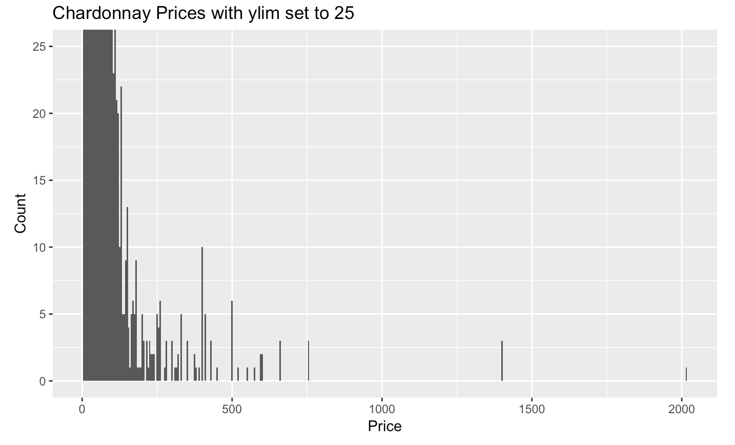
Now we can clearly see these unusual values.
Using handy data transformations in dplyr, I can remove these unusual values and plot a histogram with just the typical values.

Plotting just the typical values provides us with a nicer histogram that includes just the common prices of Chardonnay.
Now that we have this histogram, what further questions do you have? Remember how we started just looking at the the varieties of wines in the data set, and now we are looking at the more common prices of chardonnay? See how looking at just one aspect of a data set can lead to one question, and then another and another? Well, that’s what EDA is all about.
But, let’s not forget about our outliers. Sometimes the unusual values in a data set can also tell you something interesting.

Now, if you’re anything like me, you’re probably wondering what Chardonnay costs over $2,000? So…let’s find out!
After filtering the data set for the value where price is greater than $2,000, I found that that Chardonnay is from the Blair Estate Roger Rose Vineyard in Arroyo Seco, California. It was rated with 91 points, and costs $2,013. After some online research, I found that the average price of Chardonnay from Blair Estate Roger Rose Vineyard is actually $49, making it highly likely that this data point was not entered correctly.
This shows that not all data sets are perfect. While Exploratory Data Analysis provides you with information about your data set, looking deeper at the variation within a variable also allows you to clean your data, so that you have a high quality data set to work with.

[…] just performed an Exploratory Data Analysis on two continuous variables, a.k.a. covariation. Unlike variation, covariation is the behavior between two variables in which you look at the way these variables […]
LikeLike
[…] my recent post about Variation, I used Kaggle’s Wine Reviews data set to explore the variation within wine variety, […]
LikeLike