Data science is a huge interest of mine and has been for quite some years now, but before I started spending all of my free time coding, I used to do art. So, one day I thought to myself, how could I create art with data? I searched on Google and found many great examples, but one that stood out to me was the use of Voronoi diagrams.
What is a Voronoi Diagram?
In mathematics, the Voronoi diagram partitions regions of points in a 2D plane based on the minimal distance to each region.1 Basically this means that in a flat surface when broken up into n number of regions based on n number of generating points (each for one region), all other points in each region will be closer to it’s region’s generating point than any other region’s generating point.2
This explanation may be hard to understand, so here is a visual example to help:

Turning an Image into a Voronoi Diagram
In order to turn a photo into a Voronoi diagram, the image must first be turned into a data frame where each pixel acts as a data point. For the diagram, we only need a random sample of the data points (pixels) because if we used all data points, we would just be recreating the original image. Therefore, the fewer data points in the random sample, the more abstract the resulting diagram will be. Ultimately, this random sample of data points acts as the generating points for each region of the Voronoi diagram, where the color of the generating point will be the color for that entire region.
Now let’s take a look at how the Voronoi diagram actually looks when applied to an image. I won’t go into the coding details here, so please hop on over to my GitHub for the full code.
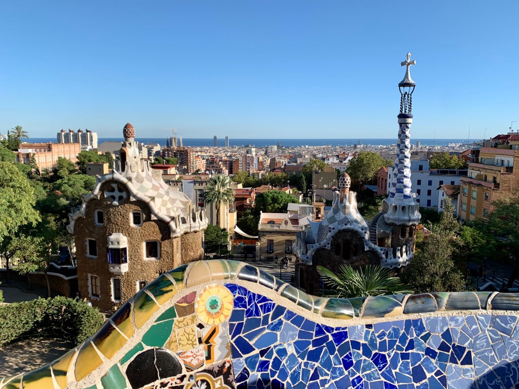
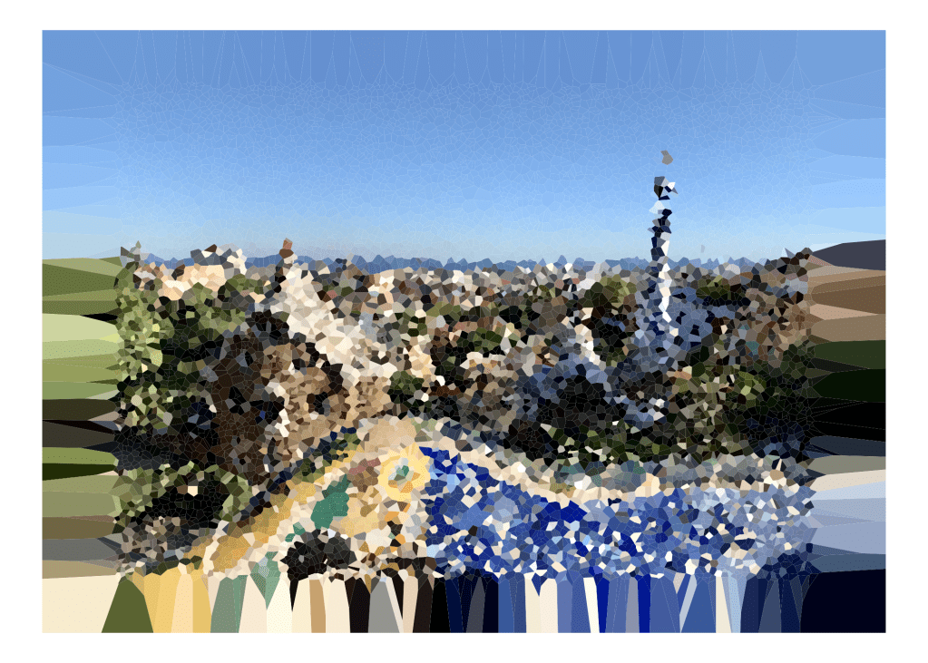
One of the first things I noticed about Voronoi diagrams is that it looks a lot like a mosaic. Don’t you agree? So when deciding on what image to use for this project, I thought why not use one of my photos from when I visited Barcelona; a city known for its Gaudí mosaics:
For you to understand how different sized random samples affect the abstractness vs. realistic outcome of the Voronoi diagram, let’s take a look at the outcomes for three different random sample sizes. When I load my image into R, my resulting data frame has ~12 million data points or pixels, so let’s look at random sample sizes of: 1,000; 5,000; and 10,000 data points.
The Voronoi diagram with only 1,000 data points is very abstract. If you had not seen the original image before this, you would have no idea what this is supposed to be:
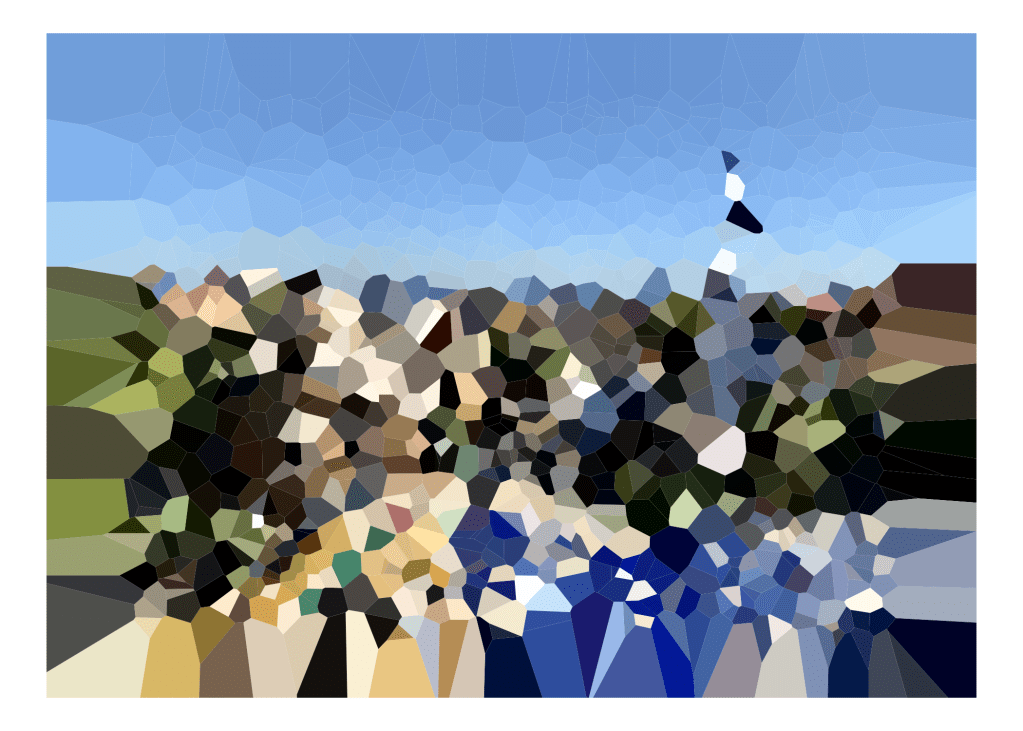
With 5,000 data points, the diagram is still abstract, but is beginning to resemble the original image:
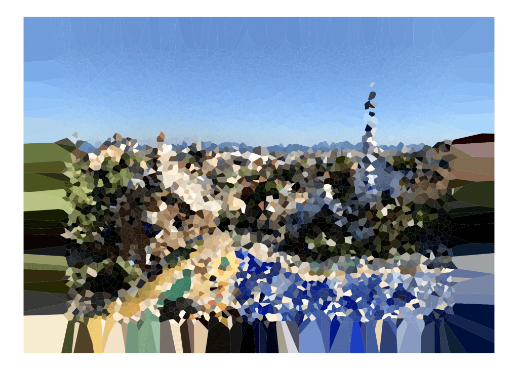
At only 10,000 data points (out of the roughly ~12 million) the Voronoi diagram looks a lot like the original image, that even a Barcelona native or Gaudí aficionado may recognize it:
Hopefully, you now have an understanding of what a Voronoi diagram is, and the three examples above clearly illustrate the impact your random sample size can have on the resulting Voronoi diagram. So, now you can try out turning one of your own images into a Voronoi diagram as well!
Sources and Important Links:
1Coding Games and Programming Challenges to Code Better. (n.d.). Retrieved March 21, 2021, from https://www.codingame.com/playgrounds/243/voronoi-diagrams/what-are-voronoi-diagrams
2Weisstein, Eric W. “Voronoi Diagram.” From MathWorld–A Wolfram Web Resource. https://mathworld.wolfram.com/VoronoiDiagram.html
Voronoi Diagram code from: https://github.com/mkfreeman/r-image-art
Voronoi Diagram code Copyright and Licensing: https://github.com/mkfreeman/r-image-art/blob/master/LICENSE
