
In my 365 Data Science training course on Tableau, I recently completed a project building a dashboard to visualizes reviews and sales data for an online marketplace audiobook company.
Tableau is the perfect visualization tool to easily glean insights about data, and this project was a great example of what a simple dashboard can tell you about your data and what further questions you may need to investigate.
Because this company is an online marketplace, user reviews are an important factor when it comes to analyzing their audiobook products, and the implications it could have for sales. For this project, I only had data on the reviews and sales for audiobooks. Some questions that a dashboard visualization of this data could give insight into includes:
- Has the number of reviews been growing over time?
- How has the average rating changed over time?
- Which audiobooks received the most reviews?
- What percentage of customers leave reviews?
Let’s take a look at this dashboard. Click on the image below to access the interactive dashboard.
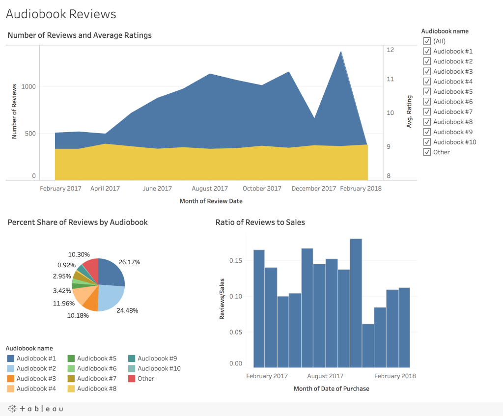
In the dashboard, the first chart shows the number of reviews (blue) and the average rating (yellow) that was given between February 2017 and February 2018. Right of the bat we can answer the first question from above – overall, the number of reviews did increase over time. Something that would be interesting to look into would be the correlation of the number of reviews to the numbers of sales. Maybe the number of reviews were increasing simply because there were more sales? Or were more customers leaving reviews?
Another answer we get from this chart is that the average rating did not change with a change in the number of reviews left, but stayed pretty consistent around an average rating of 9. On a scale from 1-10, an average rating of 9 is really good. This also shows that the majority of reviews, no matter how many there were, were good. What about customers who were not happy with their audiobook? It’s possible that customers who are not happy with their audiobooks are not leaving reviews.
The second chart in the dashboard, the pie chart, shows the percent share of reviews by audiobook. This tells us which audiobooks got the most reviews. From the chart we can answer another one of our original questions, that audiobooks #1 and #2 had the most reviews. Additionally, they made up roughly half of all reviews. You will notice that this dashboard also has a filter to filter by audiobook. So, if we wanted to know the number of reviews and the average rating for just one audiobook, we can do that. Try filtering the dashboard by audiobook and see what you find. If a certain audiobook does not have a good rating, then maybe the company should stop selling it? This filter is connected to the entire dashboard, so we can also see data by audiobook for the third chart, the ratio of reviews to sales.
The ratio of reviews to sales gives insight into how many people are and are not leaving reviews. From the bar chart, we can see that across all months the average percent of reviews left were roughly between 5% and 20% of total sales. Not many customers were leaving reviews…Following up on my earlier point, maybe customers are not leaving reviews because they were not satisfied with their audiobook? Or are they just forgetting to leave a review? Making a plan to send a follow up email to leave a review could encourage customers to leave reviews and help the company solve this question, as well as, other questions.
These are just some of the questions that I’ve had while exploring this dashboard. See what a simple dashboard can tell you? Not only can creating a dashboard answer questions that you have about your data, but it can also help you see things that you could not see in an excel sheet. It can open your eyes to different issues and bring about new questions to investigate.
Therefore, I recommend dashboarding your data when you start your next project because you don’t know what information you’ll uncover.
