Democratic Candidates’ Engagement on Twitter
Now that I have covered several posts on how to scrape tweets from Twitter, it is time to explore some tweet data. Luckily, there are easy ways to explore tweet data with regular R packages like dplyr and ggplot.
In this post we are going to explore the Twitter timelines for the front-runners of the democratic candidates. More and more people are turning to Twitter for real-time news and information, meaning that it is a great way for candidates to engage with the public. Not only that, but how candidates use Twitter can be a reflection of their authenticity and credibility in the public eye. So, let’s see how they are doing on Twitter.
For this exploration, let’s look at: 1) how many original tweets a candidate posted versus retweets, 2) which candidates replied more to tweets and 3) who candidates replied to. We will also look at which candidates received: 1) the highest average favorites and 2) the highest average retweets on their original tweets. Which candidates are we using? Recent statistics from The New York Times place the top six front-runners as: Joe Biden, Elizabeth Warren, Bernie Sanders, Pete Buttigieg, Kamala Harris and Andrew Yang.
Using R I scraped the latest 500 posts for each candidate and put them all into one data frame. (For those who are also coding, please click here for the reference code.)
How are Candidates Engaging on Twitter?
The first thing we want to investigate is which candidates are posting more Original Tweets versus Retweets and vice versa. The handy dplyr function select() allows us to create a new data frame with just the variables of the candidates Twitter screen name and whether or not their tweet is a retweet. Grouping the data based on each candidate’s tweets and on whether or not it is a retweet, allows us to plot the ratio of original tweets to retweets in a bar plot using ggplot:
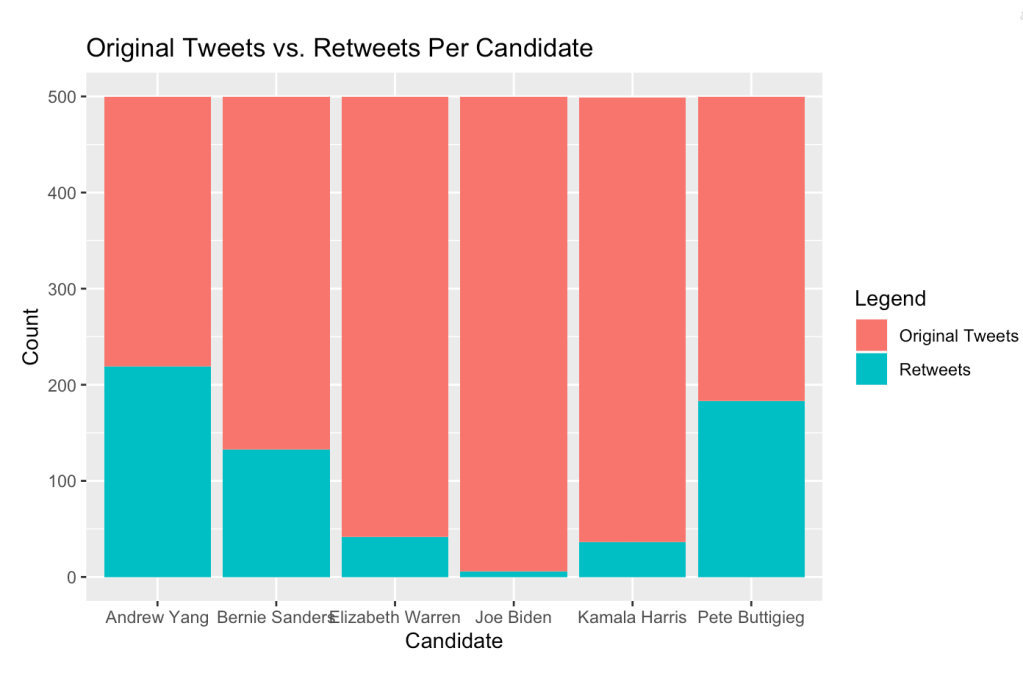
From the bar plot we can see that of all the candidates, Andrew Yang and Pete Buttigieg engaged the most through retweets, while Joe Biden engaged almost strictly through his own original tweets.
Those who post more original tweets may be more focused on self-promotion, while those who retweet more promote those who they are retweeting. Of course, this is open to interpretation. So whether more original tweets or retweets are good or bad is up to you.
Now, let’s look at which candidates engaged more on Twitter by how many tweets they replied to. Using a similar method to the above, we can create a new data frame with the select() function to get the candidates screen name and the screen names that they replied to. Finding the count of replies segmented by candidate allows us to plot how many tweets each candidate responded to in a bar plot using ggplot:

From the bar plot, we can see that Elizabeth Warren, Andrew Yang and Pete Buttigieg spent more time replying to tweets in comparison to the other candidates. This is interesting in comparison to the previous bar plot which showed that Andrew Yang and Pete Buttigieg engaged more in terms of retweeting, however, Elizabeth Warren did not. So, Andrew Yang and Pete Buttigieg engaged more through retweets and replied in comparison to other candidates.
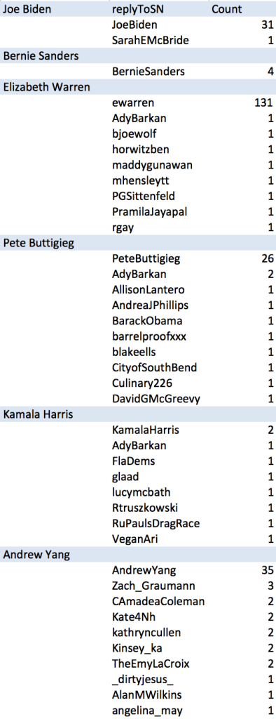
While some candidates are replying more to tweets than others, who are they replying to? And, who are they replying to the most? Let’s take a look. Using the same data, we can take a look at the counts per screen name replied to.
To the right is a table that shows the top 10 screen names each candidate replied to, and the number of times they replied to that screen name.
It is clear that, despite some candidates replying to tweets more than others, they were in fact replying to themselves more than other Twitter users.
This shows the importance of digging deeper into data, because not all bar plots can tell the whole story.
Which Candidates are getting the Most Engagements?
Now that we have a better understanding of how the candidates are using Twitter, let’s take a look at which candidates’ original tweets have the most engagement from Twitter users.
To see which candidate had the most favorites on average, we will need to create a new variable in our data frame called “Average Favorites”. Finding the average number of favorites per candidate is simple, just find the sum of favorites for all original tweets per candidate and divide that by the number of original tweets. Using the dplyr function mutate(), we can add this new variable to our data frame, and use ggplot to create a bar plot comparing the average favorites per candidate:

Despite not having the highest amount of original tweets, Bernie Sanders stands out as having the highest average favorites on his original tweets. Of course this can be due to the fact that Bernie Sanders has roughly 6-9 million more followers than his democratic candidate counter-parts, so unfortunately, we don’t have a level playing field to judge who has the most favorites on their original tweets.
We can follow the same process as above to find the average number of retweets from the candidates’ original tweets:
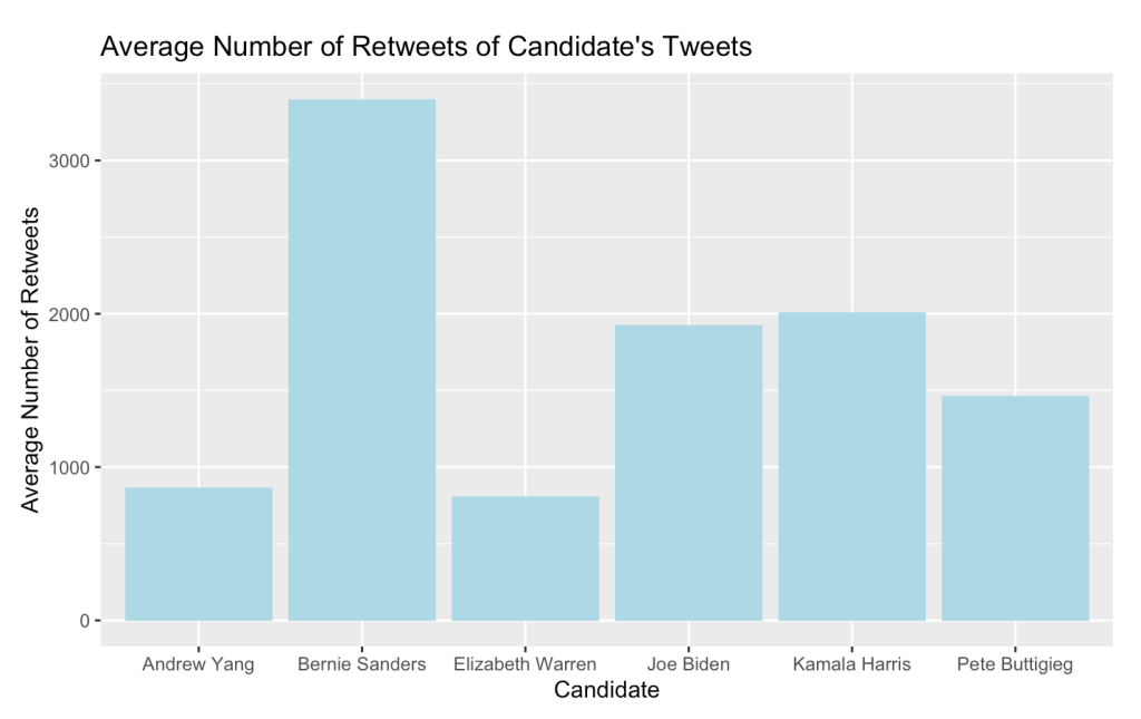
This bar chart paints a similar picture to what we saw above with Bernie Sanders having the highest average retweets of his original tweets due to a larger following.
So, which candidate is the best at Twitter? Well, that is hard to say. Bernie definitely has the advantage with his large Twitter following, but other candidates benefit from engaging more with other Twitter users.
Know that we have briefly explored Twitter users’ engagement on Twitter, the next step is to dive into a deeper analysis of what they are actually tweeting about. Stay tuned for that in a future post!

hey Anisha!! I really enjoyed this blog, especially with the looming democratic presidential primaries coming up! It was informative on which candidate is best at Twitter.
In case you wanted to reorder your plots so it arranges the x-axis into numerical order, you could add a reorder(x, y). It helped present my plots visually for readers! So your last code for the bar plot could look like:
ggplot(AverageNumberOfRetweets, aes(x = reorder(screenName, AverageRetweets), y = AverageRetweets)) + geom_bar(stat = ‘identity’, fill = “lightblue”) + ggtitle(“Average Number of Retweets of Candidate’s Tweets”) + labs(y = “Count”, x = “Candidate”) + scale_x_discrete(labels=c(“Andrew Yang”, “Bernie Sanders”, “Elizabeth Warren”, “Joe Biden”, “Kamala Harris”, “Pete Buttigieg”))
Happy blogging and love reading!
LikeLiked by 1 person
Thank you for that tip Bomi! I will keep that in mind 🙂
LikeLike