A Look at the Distribution of Pizza Menu Prices
In this post, I will be covering how to create a violin plot and how to use a violin plot to look at the distribution of a variable, and compare distributions of a variable.
What is a Violin Plot? Similar to a box plot, a violin plot depicts the distribution of a data set by showing the spread of the data. In addition to this, it also depicts the density of values at a certain data point. So not only can we tell what values a data set contains, but we can also see how many data points in a data set consists of a specific value.
Violin Plots are appropriately named because of the curvy shapes they create, similar to that of a violin.
To demonstrate, I explored Pizza Restaurant Menu prices from different U.S. cities. I downloaded this data set from Kaggle, and the data for it was gathered by Datafiniti. Click here to follow along with my reference code.
Creating a Violin Plot
Before we get to the plot itself, you need to make sure you have the proper packages installed and loaded. For the violin plot all you need is ggplot2, but if you want to make any data transformations, like I did, then you will also need the tidyverse.
First, I wanted to take a look at the New York Pizza Prices. Therefore, I transformed my data by filtering for “New York” data only, and created a violin plot of the Max menu prices with the following code:
NewYorkPizzaPrices <- filter(PizzaPrices, city == "New York")
ggplot(NewYorkPizzaPrices, aes(x=city, y=menus.amountMax)) + geom_violin(trim=FALSE)
As you can see, creating a violin plot is similar to creating any other plot with ggplot: select your data frame, your variables and the proper geom_function. Let’s see what this plot looks like:
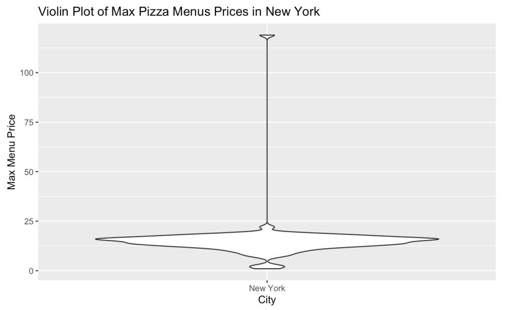
From the above it is blatantly clear that we have an outlier issue here. Upon further investigation, I found that the highest data point valued at $118.99 at the California Pizza Kitchen. Based on their online menu, there is no way they could have something this expensive suggesting that this must have been entered in error. So, upon removing that data point I re-plotted the below:
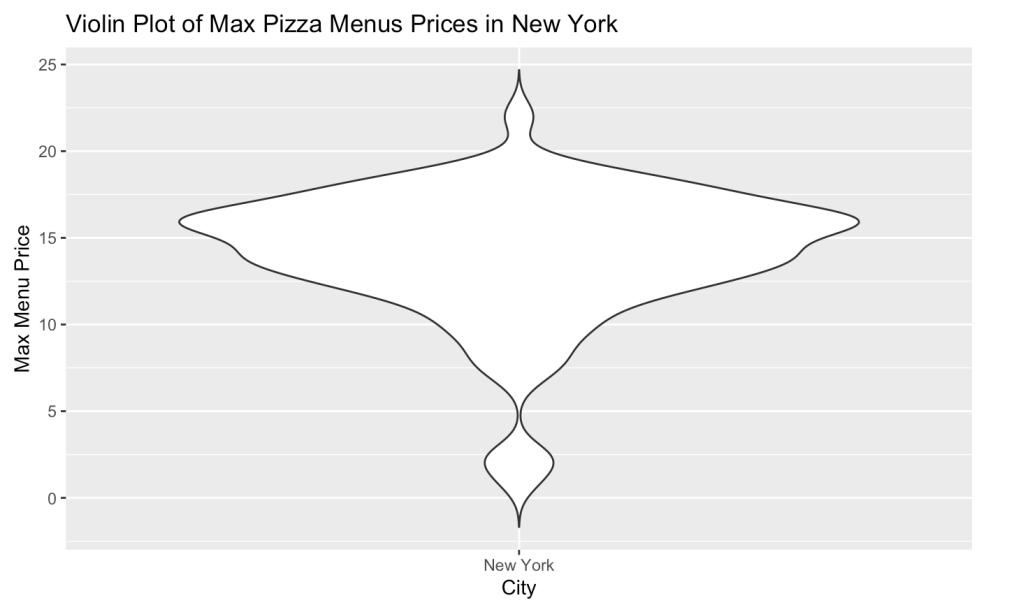
Much better! Now we can see that the majority of the menu items are priced between $10-$17. But, what if we wanted a better idea of where certain data points are. For example, it is not easy to pin point where the mean or median might be in this plot, which may be beneficial later when comparing violin plot distributions.
Luckily, it is possible to add this kind of information to a violin plot.
Adding the Mean and Median Points to a Violin Plot
We can add mean and mediam points to our violin plot with the stat_summary() function. Try out the code below:
ggplot(NewYorkPizzaPrices, aes(x=city, y=menus.amountMax)) + geom_violin(trim=FALSE) + stat_summary(fun.y=mean, geom="point", size=2, color = "blue") + stat_summary(fun.y=median, geom="point", size=2, color = "red")
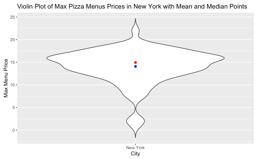
We can see that the mean and median are near each other, but the mean, in blue, is just a tad bit lower; this can be attributed to the pull of the lowest priced items. If we wanted even more information from our violin plot, we could even add a box plot to it!
Adding a Box Plot to a Violin Plot
Adding a box plot to a violin plot is just like making any regular box plot: add on the geom_boxplot() function:
ggplot(NewYorkPizzaPrices, aes(x=city, y=menus.amountMax)) + geom_violin(trim=FALSE, fill="lightblue") + geom_boxplot(width=0.1)
In the code above, you will notice that I have set the width of the box plot to 0.1. This is so that the box plot stays within the bounds of the violin plot. You will also notice that I added a “fill” attribute to the geom_violin() function, because why not add some color?
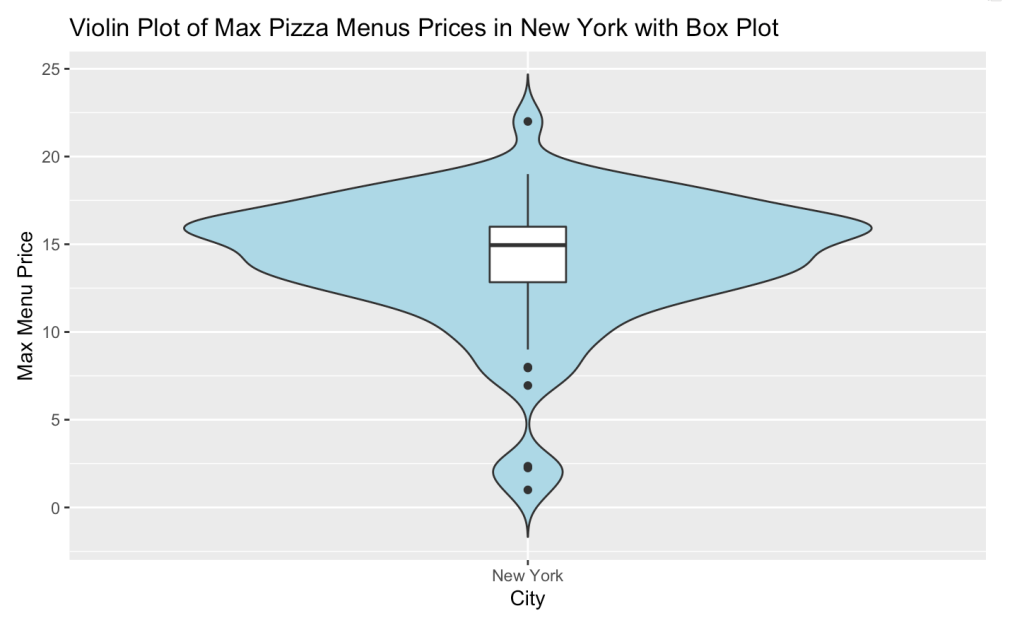
The box plot with the violin plot reaffirms what we observed above: those lower priced items, which are outliers, is in fact making the mean lower than the median. Additionally, we can clearly see that the median line is right around $15, while the violin plot depicts the density of those data points. This shows how combining two data visualization plots to explain a data set is a powerful tool.
Comparing Violin Plot Distributions
Now that we know how to make a violin plot, and how to add features to it, let’s actually compare some distributions with it. Specifically, let’s compare the New York Pizza Menu Prices to two other large cities in the U.S.: Los Angeles and Chicago.
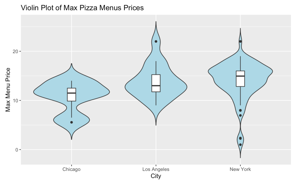
Chicago, home of the Deep Dish Pizza, has lower priced pizza menu items than Los Angeles and New York, but does not have the lowest priced items. The prices for NY actually have a larger range with a few cheap menu items, and the highest priced menu items are in Los Angeles. At the end of the day, New York wins for having more expensive Pizza menu items.
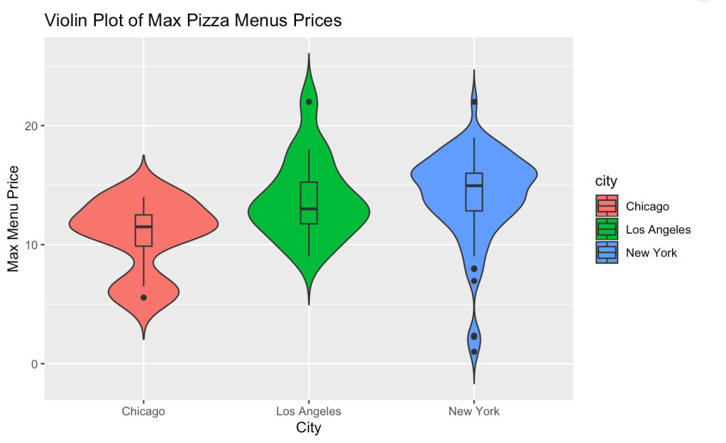
Lastly, purely for visualization purposes, you may want each category in your plot to be a different color. To do this, you just need to add the “fill” attribute to the ggplot() function and set it equal to the name of your category:
ggplot(Cities, aes(x=city, y=menus.amountMax, fill=city)) + geom_violin(trim=FALSE) + geom_boxplot(width=0.1)
I hope you enjoyed this brief intro to violin plots. There is so much more that can be done with them, but too much to be covered in this one post. I trust that you will enjoy exploring more with violin plots.
