
A Look at the Average Price of Avocados in New York
When working on any data science project, you will need to transform data into the proper form to work with. This can include creating new variables, renaming variables or reordering observations in a data frame. Overall, we just want to make data easier to work with. This is where the dplyr package comes in. As part of the tidyverse package, dplyr allows us to transform our data.
The five main dplyr functions we will be covering are: filter(), arrange(), select(), mutate() and summarize().
The data set that we will be working with contains information on avocado prices and more from 2015 through 2018. Before working with the data set, make sure that the tidyverse package installed and loaded. Then, we can read the avocado excel file and preview the data set with the colnames() function to view the column names and see what variables we have to work with.

This data set contains 14 variables including dates, years, average prices and regions of avocado sales. It also contains the total volume (or number) of avocados sold and more. The first column is named “X1” because it was missing a name in the excel file. This column just assigns numbers to each row and we can eliminate it from out data frame by getting right into some data transformation.
The select() function allows us to zoom in on a useful set of data. In this case, we will select all variables except the first column, X1, and assign it to a new data frame called “avocado”. We can select all of these variables by using a “:” between the “Date” and “region” columns. See the code below:
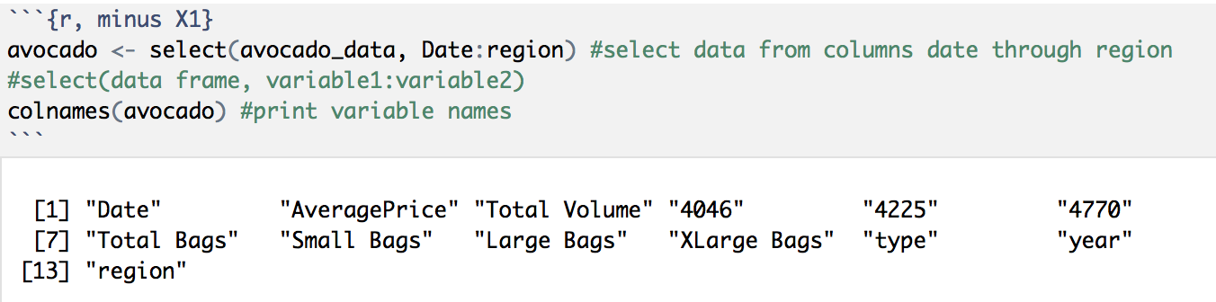
We can see that this new avocado data frame excludes the “X1” column.
Part of transforming data also includes having consistent variable names, so let’s rename the remaining columns names so that they are all aligned using the colnames() function to assign new column names:

Now that all of our variable names are capitalized and have “_”, let’s move into our next function: arrange(). This function allows us to arrange our data observations ordered by a variable or column. Let’s arrange our data by “Date”, and the “Average_Price” as a second factor to see how this function works:
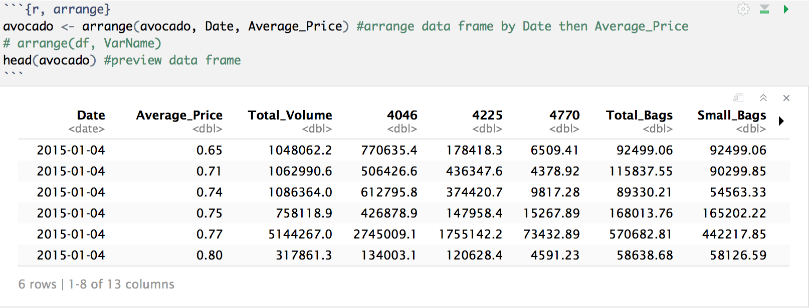
We can see that our data frame, which was originally ordered by region, is now ordered first by “Date” then by the “Average_Price” for each date.
Let’s now take a look at a more specific subset of the data. How about we take a look at the data for avocados in New York year over year? Since the data set does not have data for all of 2018, let’s remove these data rows and focus on data from 15′-17′.
We are able to subset variables by specific values using the filter() function. So, let’s filter our avocado data frame to create a new data frame, NY_15_17, that only contains data for New York in the years 15′-17′:


Taking a look at this new data frame, we can see under “Region” that it only contains observations equal to “NewYork”, and that under “Year”, it does not contain any observations for “2018”.
Now that we have our data selected, let’s create a scatterplot of the average price of avocados throughout the year split by year. We can do this with a ggplot point plot and facet it by year; or in other words, create a separate plot for each year.

From these plots we can see that in all years, the average price of avocados fluctuated throughout the year. Avocado prices in 2015 and 2017 peaked mid-year while prices in 2016 stayed higher towards the end of the year. Additionally, 2017 prices seem to be higher than the previous two years.
Now let’s take a look at how the number of avocados sold affected the average prices. For this we will plot “Total_Volume” vs. “Average_Price”. But before we plot, looking at our data frame, we can see that the observations for “Total_Volume” range across several orders of magnitude which may not result in a very clean plot. We can use the handy log transformation helper function to take the log of our “Total_Volume” column in order to work with smaller values.
Not only that, but we can take the log of our “Total_Volume” column and add it to our existing NY_15_17 data frame with another one of our dplyr data transformation functions: mutate(). Let’s take a look at the log() and mutate() functions in action:

Taking another look at the column names of the data frame, we can see that the new column called “Total_Volume_Log” with the log values of “Total_Volume” was added to our data frame, and we were able to do that in just one step! Now we can return to our “Total_Volume” vs. “Average_Price” plot, but this time use our new “Total_Volume_Log” variable.
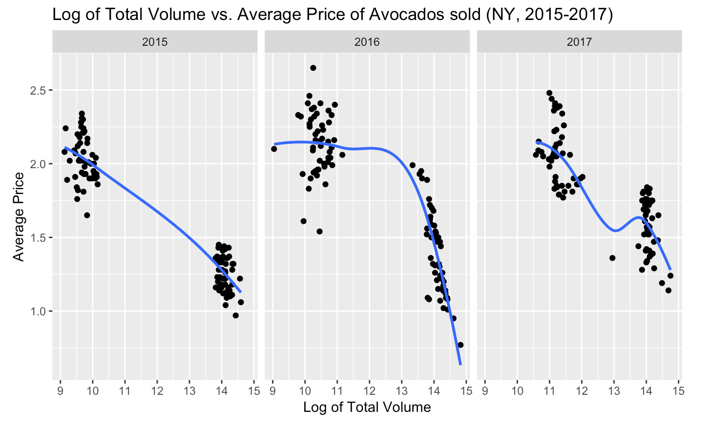
Do these plots remind you of something? How about the supply and demand model? We can see that when the volume of avocados sold was higher, the average price was lower.
Based on this information, if we think back to our original plot of average price throughout the year, we would expect that the average price dips correlated with larger volume of avocados sold and vice versa. By scaling our original data points with color using “Total_Volume_Log” data, we can actually see if this was true:
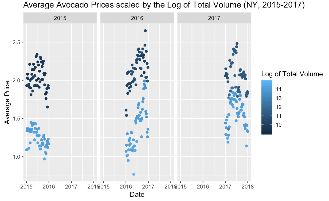
And to no surprise, the lighter blue points which represent a higher volume of avocados sold are reflected in the data points where the average price was lower. And vice versa, this correlates with higher average prices at lower volumes of avocados sold.
Now, for our final dplyr data transformation function we will focus on the “Average_Price” of avocados sold in NY. Specifically, we will find the median value of “Average_Price” by using the summarize() function. This will collapse all observations of the “Average_Price” variable into one single observation.

Using summarize(), we just collapsed the “Average_Price” variable into one row that contains its median, which shows that the median average price of avocados sold in New York from 2015-2017 was $1.81. The summarize() function is even more useful when combined with the group_by() function, which allows us to use an individual variable or group as the unit of analysis instead of the entire data frame.
For example, instead of summarizing the “Average_Price” by all variables in the data frame, we can find the median by year with the group_by() function. First, we will create a new data frame grouped by “Year”, and then summarize that data frame.
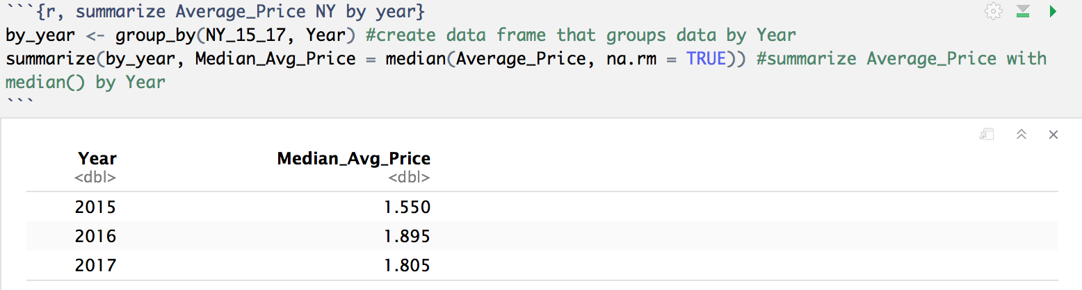
Now, instead of collapsing the “Average_Price” variable into one row that contains the median for the entire data frame, it is now collapsed by the data frame grouped by “Year”. See the difference? In 2015, the median average price was $1.55; in 2016, the median average price was $1.90; and in 2017, the median average price was $1.81.
An easier way to accomplish the two steps above of: 1) creating the data frame grouped by “Year” and 2) summarizing the data is by using a pipe to combine the two steps into one command. We can go over pipes in detail in a later post, but for now, see how we can use a pipe, %>%, to accomplish both of these steps and print the results in the code below:

We just combined a three-step process into one step. Imagine how useful this can be when working with larger data sets and using more steps or operations.
These five dplyr functions can do wonders when it comes to formatting data sets, and as we saw, each function has their own set of functions which makes transforming data sets even easier. We have only scraped the surface of what is possible with data transformation, and hopefully we can explore some other functions in future projects.
Click below for the full R code.

[…] my Data Transformation with dplyr post, I covered how you can transform data with dplyr functions. In this post, I will introduce […]
LikeLike